Negative Space in Architecture
In my current role as something of a troll/ busy body: I posted the below to an architecture blog because someone had posted a comment expressing interest. What this has to do with hummingbirds? You'll have to read the whole business.
And in the unlikely event anyone expresses any interest in what I've written, I'll add photos and drawings. I think I know what I'm talking about and anyone else, especially those with expertise.... well, I'm interested in hearing what you have to say. Either I've missed that every architecture program extensively covers this, or I've noticed something most have forgotten, never really learned or something. Christopher Wren did get there 300 years before me....
>>
While visiting London I think like most people St Paul's Cathedral was a landmark, but you don't really look at it.... The people who run the place seem to believe deeply in this approach. Cameras are not allowed inside and inside it's chockablock with geegaws to British military and imperialists. It's like a dime store Yakasuni Shrine.
Well my son said he wanted to see it, so okay. As we approached I started to look at it. What I saw was borrowed from Michelangelo of course, but Wren had gone a significant step further. I realized that I was looking at a brilliant use of negative space. Wren had finely tuned in the spaces between the 'windows' and the columns. So I think St Paul's in London is a brilliant example of the use of negative space in architecture; perhaps an early use of it.
I can find no discussion of this anywhere and two London architects I mentioned this to, just blinked and moved to another car on the train. (It wasn't that bad, but this is funnier. Still I don't think they had a clue what I was talking about. I wondered for quite some time if negative space is called something different in architecture. (Looking at a lot of Roman stuff, I see zero attention to negative space, some brilliant design of course, but no consideration to negative space. Of course the aqueducts were only ever about negative space, how much water can we move through this carefully engineered and designed void, and how little stone and concrete can we use to support it? So perhaps better expressed might be: 'no aesthetic use' of negative space.)
I was primed to notice the columns and how they're not evenly spaced, but paired. This is because by the time of the Renaissance/Baroque engineering had advanced. The Greeks used only as many columns as they thought they need to support the pediment. Wren had options and I think he used them. Also, with no extensive, or even basic, research I wonder if the spacing of the columns at St Pauls isn't the first time this was done. I'm probably wrong, but if you're interested in negative space in architecture might be worth a look. Why was I 'primed'? About twenty years before I made a table, arts & crafts, Stickley style. I had two legs with two beams and 5 staves in the middle. I made the center stave wider and stronger, but two pairs? I played around with them a lot. I thought I was following some kind of tradition in furniture design. Now I don't think I was. I placed them and looked and looked. (Architects do this too, but too often they spend too much time talking about it. I've seen that a lot). I finally arrived at a spacing of slightly wider than a stave width from the wide center, then I think evenly spaced. It was quite satisfying to me. I've made other furniture since and have done the same thing. Each time spending a lot of time just looking. I think my design solution is good, possibly unique. When I finally really looked at St Paul's this came to mind. There's a lot of blank space on the facades of St P's, I think a continental Baroque designer would think, make the elements bigger. I think Wren looked at what he was doing and.. heard music. (Miles Davis and probably JSBach would tell you some of the most important notes are the ones you don't play. Many times people will remember hearing a note or a beat that isn't there.) And then the whole business with Wren having final say and taking 35 years. Well, to me that's like me just looking at those staves until they looked interesting. I imagined Wren spending a lot of time on the site just looking and then making changes as his ideas continued to develop. The proof of this I think might be found in looking at the design of the foundations, then the column bases, and then the frieze, which I think juts out more dramatically than the bases. It's really quite exciting looking up inside. Also, how is this similar to or different from the current practice at the time and the classical and Neo-classical predecessors? Another clue would be to examine the early drawings and model and the final results. Another 'proof' might be to take the existing facades and make the windows and columns a little larger or smaller, change the spacing. I know of no formula for negative space except this general idea: Balance is positive and negative spaces being the same. Next level is to make larger what is less. So blank wall space needs to grow relative to the columns and windows. negative space that is closer to bolder elements, to balance with smaller less bold elements, make that space a little bigger. The Mexican painter Ruffino Tomayo. I was photographing a not very spectacular painting of his called Three Musicians. It was like being hit over the head. I can't think of a more perfectly balanced painting. His use of negative space is wonderful. I just googled negative space in architecture. I've been doing this every couple of months just to see what I might find. I think negative space is deeply underused. As a gimmick? Sure, plenty of examples, especially in advertising. But as a tool? I found a ceramic tile pattern I liked but then wondered... so I played with it in Illustrator. I think this is a great way to tune up one's use of negative space. In architecture? The possibilities are endless and not done. Light changes of course, there's field ground reversal. The easiest to find example of this is in the evening twilight when the sky looks like it's in front of tree branches. If anyone is interested in my examples this site can give you my email. Or google "hummingbird negative space" and one of my net places should show up. -Will N <<< And so I copied and pasted and fiddled it here.
Wednesday, April 22, 2020
Saturday, November 3, 2018
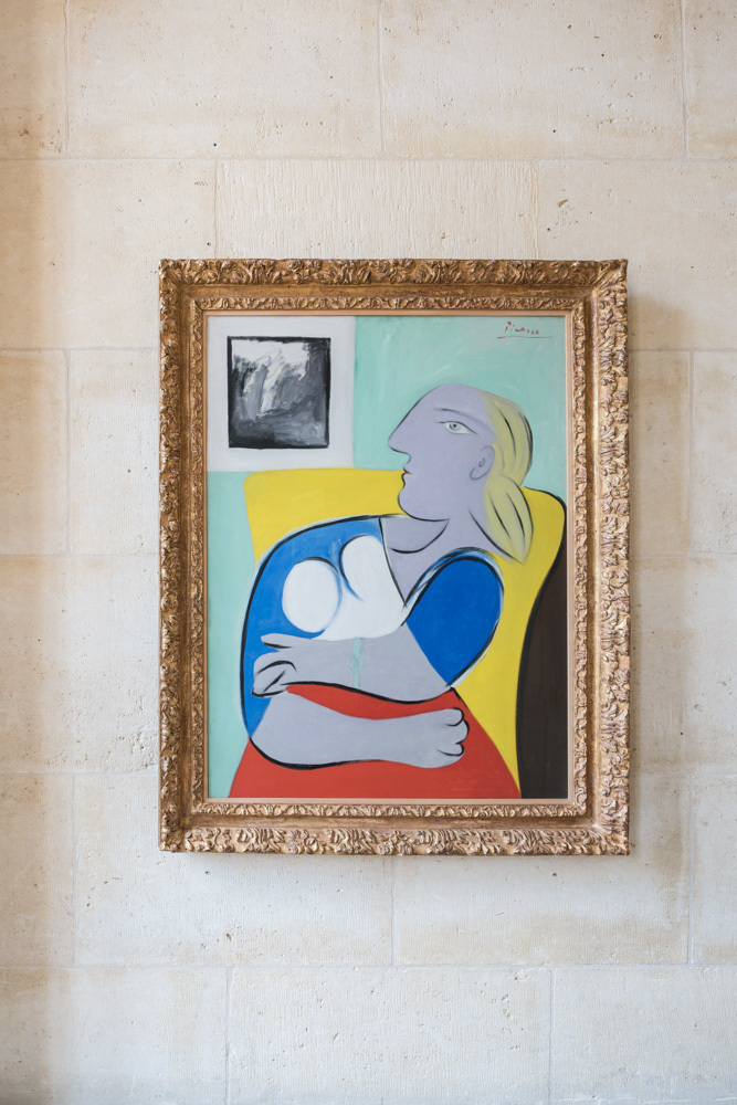
William Brice, Picasso,
I was just fuzzing around wasting time writing stuff no one will ever read and wrote this:
As a photographer with film it was often said "You can't really photograph an oil painting." This is because the pigments available for oil paint came from different pigments, many of them metals. Fanny Brice's son William, a painter once showed me a magenta from a tube and the same magenta that he mixed from a red and blue. He asked which is different? I know a bit about these things, and it was clear they were the same. Okay. Which is better? Huh? Which one do you like better? Just pick one. I picked. He put a dot with a sharpie on the bottom of the tin foil it was in. He had me close my eyes. He switched them and asked me to choose again. He did this about four times. Then he showed me the bottom of the tin foils. Every time, I had picked the same one. He said that on a microscopic level that we couldn't see the red and the blue were still separate. We couldn't see it, but instead of one color, there were two colors 'vibrating' (his term but not correct) to make the same color. It was more exciting this way.

 This is the painting with the magenta I wrote about. I didn't capture the difference on film.
As a photographer with film it was often said "You can't really photograph an oil painting." This is because the pigments available for oil paint came from different pigments, many of them metals. Fanny Brice's son William, a painter once showed me a magenta from a tube and the same magenta that he mixed from a red and blue. He asked which is different? I know a bit about these things, and it was clear they were the same. Okay. Which is better? Huh? Which one do you like better? Just pick one. I picked. He put a dot with a sharpie on the bottom of the tin foil it was in. He had me close my eyes. He switched them and asked me to choose again. He did this about four times. Then he showed me the bottom of the tin foils. Every time, I had picked the same one. He said that on a microscopic level that we couldn't see the red and the blue were still separate. We couldn't see it, but instead of one color, there were two colors 'vibrating' (his term but not correct) to make the same color. It was more exciting this way.
William Brice was an artist who could be described as a follower of Picasso. He used Picasso's method of making a lot of drawings as he worked through ideas.
I photographed a stack of these for his gallery L.A. Louver. They were all on higher quality typing paper. He probably threw a lot of them away.
I spent some time with him while shooting his work for a catalogue for a show as Los Angeles Museum of Contemporary Art (MOCA).
Fanny Brice was a Ziegfeld Girl and comedienne, Vaudeville and radio. The Barbra Streisand movie Funny Girl was about her.
(His father was Nicky Arnstein a gambler, con artist-- not quite a gangster but he did scheme with Arnold Rothstein who'd 'fixed' the 1919 World Series.
William Makepeace Thackery near the beginning of The Luck of Barry Lyndon: wrote "The above-named personages lived and quarreled; good or bad, handsome or ugly, rich or poor, they are all equal now.” He wrote this about the Barry Lyndon's parents and connections. Stanley Kubrick more wisely used it at the end of the movie Barry Lyndon. I read somewhere that Kubrick had made a 20th century movie about a 19th century novel about 17th century characters. To this I would add: we get it right eventually. (Which makes this a 21st comment about....) Bill took his mother's last name, which likely undermined any chance he might've had making it in Brooklyn. )
About Bill's art and Picasso. Probably the best thing anyone can do with a work of art is to spend a lot of time around it, without having to do anything about the 'artness,' of it. Then whatever it has has a chance to seep into your brain. Conversely, the worse thing you can do with a work of art is stand around it with a plastic cup of crappy white wine and worry about your social position. Then you hear yourself saying nonsense like, 'magnificent', 'spectacular' 'astonishing,'... which is a direct quote from someone who clearly knows better, but they had to try everything out until they could come up with something they could say without giving themself away...
So I photographed a few Picassos, a lot of William Brice, and a few other characters who were much farther removed from corrupting baseball. When Picasso 'tried' something, it usually kind of worked one way. If it was meant to pop out, it popped out. Brice was different. Some elements in his paintings were meant to pop 'in' others to pop 'out', but often they would do both. I don't think he intended this, but I do think he accepted it. If you were lucky enough to live with one of his later works, when he was clearly making this happen, you could walk by the painting every morning, in a hurry to get to work, and then one morning out of the corner of your eye you would notice, 'that bit is popping out today. Huh. Usually it mostly pops in.'
I think this is one of the great successes in art, but it takes seeing a lot of stuff to notice. Optical illusions are called optical illusions because right away just about everybody gets that there's something going on.
Working for an art dealer who seemed on the surface like just another art dealer till you got to know him (had Saul Bellow met him, he'd have written a novel about him); he had a lot of heart. Anyway I got to photograph a late Picasso Mousquetaire (Musketeer as in the Three Musketeers), 8x10 took most of a day. At the time, the early 1990s, these late Picasso paintings (Picasso died in 1973), were considered to be the lesser works of a painter past his prime. Something like that. (Keep your memory, keep a journal, because later on everybody misremembers almost everything they said, or heard everyone else saying, at the time. How many ghost written celebrity memoirs remembers things like, 'No one thought the moon landings were very special at the time, but I said....')
Anyway it was a bit of shock to see it for the first time. Like finding a disheveled homeless guy in your living room. But okay, I was busy. I had to set up a big camera, lights, put filters on the lights, load a lot of expensive 8x10 film into holders, measure, take a lot of light meter readings.... But you can't not notice a big busy painting. Like Bill Brice's paintings, it had a lot of popping in and out. (This stuff by the way is from Cubism, prior to that this sort of thing was probably referred to as 'a bit of a problem, there...' and the painter would add a few layers of a wash to tone down the part. Field Ground Reversal is one way this stuff works. At dusk pay attention to tree branches and the sky. There's always a moment when the sky appears to be in front of the branches. It's a wonderful thing, well worth learning about and looking for.)
I think I was at least 3-4 hours into photographing it when I really began to appreciate it. I'm not some third grade teacher parading a bunch of kids through a museum and over working the words 'great' and 'masterpiece.' It's probably not as much a factor of time as it's when I start exposing film. With a large painting, polarizer gels on the lights (cuts the light two stops (1/4 of the light gets through) polarizer filter on the camera (another two stops, so 1/16th of the light is all that makes it to the camera. Then with film there's Reciprocity Failure.
All things being equal, when you make a 1 second exposure, you have twice the light as with a 1/2 second exposure. So 2 seconds should be double the exposure as the 1 second.... Except the longer the exposure the more 'reciprocity failure' occurs. I forget if it was Polaroid Type 55 (I still have some) or 6118 Kodak Tungsten balance color transparency film, where a 2 second exposure actually needs 5 seconds. So likely I'd be exposing film on the Picasso for 2 to 5 minutes. You have to stand still for this so you don't shake the camera, and this is when you have a chance to look at the painting. Prior to that the painting was just sort of there. It's a wonderful process. I would often come home after a night of photographing an artist's work, not spending any time thinking about it, and my partner would ask, 'So what was the work like?' and all this stuff would just come out of my mouth. It's like that disheveled homeless guy suddenly appearing in your living room, How'd he get in here? and Where did he learn so much about art?
So that's when the Picasso Musketeer did its magic on me. There was just so much stuff going on. There was nothing past anybody's prime in that painting. It was like a loud Picasso art party. The main figure was giving you the eye, but when you looked at him, he seemed to be looking past you. The Mona Lisa smile trick? Picasso had this sort of stuff going on all over the place. There's nothing like a nose pointing off in the wrong direction to keep a face in a painting busy. Rembrandt who had a crooked nose, figured this out long before Picasso. (Somebody like Waldemar Januszczak could probably make a very entertaining and funny video about Cubism beginning with Rembrandt's nose).
The Mona Lisa Smile Effect in case you've somehow missed this is her mouth has two dimples at the ends of her lips. These dimples make little shadows. When you look right at her mouth, she's just sort of waiting for you cut it out, but when you look away, the less sharp parts of your eye sees her face blurrier and so those little shadows upturn the ends of her lips into a smile, but then you look back and she's still not interested.
Was Picasso aware of this? Probably but I don't know for certain. I'd have to go look at a bunch of Picassos, and then look away from them to see if this trick is there.
What I was going to say about Picasso: is the way to understand his work is to see a whole bunch of his work from about the same time. For me this was L.A. County Museum of Art, LACMA. There was a show of a couple hundred Minotaur drawings. You could see Picasso fiddling with, working on, various visual tricks. This past spring I was in London at the Tate Modern where there was a terrific show of Picasso work from 1932. He was working in some estate he'd just bought. Wife in the main house, mistress up in the studio....usually Picasso, rock star, Christian TV evangelist stuff.
In several of the paintings he was working a double triangle 'thing.' It was based on a narrow waist and shoulders and hips. Think two similar triangles that connect at their points. Clearly he got this from his female models reclining. But it wasn't until he painted a seated figure, turning the triangles vertical, that he got it to really pop. If the two triangles are equilateral, or appear that are, then any distortion to them makes them appear to be planes different from the surface of the canvas. Not much of a trick, but interesting in a drawing or painting. So the seated figure, it's the one with the crossed out 'painting' in the upper left corner. (I really should have included about 20 images by this point.... Maybe if anyone ever reads this and asks)
See how the top of her body is twisting towards the image in the upper left?
The more abstract painting above is not as figurative as the ones I remembered. I guess the Tate Modern didn't allow photography, because I have no snaps of these.
Now there's two more things at issue here. Let's assume for the moment that you accept my Picasso's interest in double triangles to represent non-planer masses. It works great here, but in some of the reclining figures not so well. To demonstrate what I was talking about to my partner I just cut out a double triangles in paper and twisted them. Dead simple. Did Picasso do this? I don't think he did. Why? Because when I spotted the double-triangles in some of the paintings it didn't work, they didn't impart planes, just triangles. Was he doing something else? Probably, but I think it's pretty clear he was first after what I'm going on about. Had he cut out paper and fiddled with it, he would have quickly seen what sorts of angles worked, and what didn't.
What this suggests to me is that Picasso did a lot of his visual tinkering from the figure, meaning with his model right in front of him. And likely he might have made this a kind of rule.
The second thing about Picasso is that none of this triangle stuff seems consistent enough to suggest it was even close to being a primary interest; what might he really be after? (He was also very clearly determined to use the general principles of cubism to show butt and breasts, and pudendum in the same painting.)
I walked into a gallery at ACE in Beverly Hills where there were at least two dozen 3/4 size bronze busts of women by Robert Graham. In this crowd from the door, I immediately spotted the sculptural portrait of Angelica Huston even though she was deep into this 'crowd' and was facing away from me. That's accuracy in representational art. Graham was married to Angelica, I worked for him and saw her many times. I've recognized in person more than a couple of his models up to five years after they were sculpted by Bob.
It's very clear to me that art made from a live subject in the studio, is very different from art made from photographs, or from following proportion formulas.... There is nothing more boring than a whole slew of sexy women art that have no real model. Are you bored? It's not from life.
Picasso understood this, but he also had to understand this and a whole lot more because he had 80 years of work. Experience counts for a lot. So I can say, I notice this about Picasso's work, his practice. I know a lot, because I'm 60 years younger than Picasso, I should have been able to begin with more information than Picasso, and yet my experience informs me that someone having done a lot more over a longer period of time will not only know and understand some things much better, but probably also knows things he's not even aware of.
So Bill Brice. He started out working with models, was accomplished in all the art school requirements and skills. I think Brice probably worked a lot without a physical model and this is why his visual tricks pop in and out. It's probably not better, it probably limited his art, but he worked at it and made art.
And while I'm dropping names. The Tate Modern. Seemed a bit hoidy-toidy. Something about the place was annoying to me. But Picasso? Okay.
Going up the escalator to the show, you can see a video clip of Picasso from 1932, home movies kind of stuff. The first glimpse of Pablo is between the legs of the people ahead of you on the escalator. He's sort of mugging at you, like Lita Albuquerque and Jim Morphesis peeking into your car window on the L.A. freeway in Kent Twitchell's pair of murals made for the 1984 Olympics Arts Festival. So ten points Gryffindor for this.
The show was pretty good. I never get those zombifying headsets with the curator droning on about stuff that has nothing to do with what the art is doing or trying to do. I'm not even sure which wife and which mistress were at issue in 1932. #MeTooPicasso? I'd be shamed for writing about the old philanderer and user.
So the way I look at art is probably like Jay Leno looking over a dusty car in a garage: is it the rare model or the common one? Are the tires original? Does it have the dual exhausts? Is this the one with the vacuum cruise control.... poking here and there. Seeing something in two paintings deep into the show, the triangles, and then going back to the beginning and looking for them in paintings I'd already looked at.
I noticed this old man in a wheel chair with two very doting young companions. He had a huge head. The companions were calling him, "Sir John." Must be somebody somebody I thought. In front of one painting of a nude with black strips he said, "Almost no one notices that she's tied up." I certainly hadn't noticed. He said a couple of other things that made me think, "This guy knew Picasso. Cool."
Later I gave Google a shot. Easy. Sir John Patrick Richardson, art historian, 94 years old, biographer and friend of Picasso, Francis Bacon and Lucien Freud (two other artists who work was was looking for. Bacon is right handed, Freud left handed. I guessed this from looking at their work. This will be part of my How To Look At A Rembrandt -- if by any chance you immediately know exactly what I'm talking about, let me know. ) So that's cool. I didn't bother him. I didn't know anything about him or his work, so I had nothing to say. What I've found is that a book is very almost always more interesting than meeting the person who wrote it. A meeting is so shallow, the famous person is going to do what? Immediately tell you what they're working on now? (If they do that they're a dull self-promotor and they've walked up to you.)
If you do the 6 Degrees of Separation to this blog it'll be pretty impressive. We are all much more connected than we realize. If we pay attention, think about things; learn as much as we can about how the world, and the things in, it work and keep a journal, have a good memory-- it's amazing how connected we all are to everything else.
Okay, enough nonsense.
Friday, February 23, 2018
B&W Film Photography for Millennials
I’m an old photographer and I’m always surprised at how many people under the age of 30 say “I want to do black-and-white film.”
I usually groan a bit, then I ask, “Are you prepared to spend hours and hours in a darkroom and have most of you images not work?”
They always say yes,
I love black and white, but the hours and hours....

Bazyl & Spike
Here’s what would work: [I know because I did it]
Step one: Shoot film,
(hopefully there’s a good light meter in the camera, or they have a DigitalSLR (I quickly learned that the meters in DSLRs are smarter than me, the Zone System, Minor White, Ansel Adams, Edward Weston....wait, he never used a light meter. I use the DSLR exposure for the ISO. Forget handheld or spot meter. Too many variables--the DSLR meter is always smarter (back light, sure sometimes that's a problem).
Forget the zone system. It's a lot of endless worrying. I found it good to know about, but using the broad concepts was usually more practical and more useful.
Process the film (Weston used a pyro developer which had some nice qualities, especially developing to exhaustion. The density range is almost self regulating. The end of my B&W career, I was using a pyro developer.)
Then: Scan the negative,(This is to make a mask, so super hi-resolution isn't required, but it'll help when you're in Photoshop. The critical factor is to keep everything 1:1 in size)
Open the scan in Photoshop, make the best possible adjustments and
Then using an inkjet printer, printout onto transparency film with an inkjet printer a MultiGrade adjustment mask.
Take this into a darkroom, sandwich it above the neg and you’ve just save 20 years of endless frustration learning. There’ll still be some dodging and burning.
I’ve done this following a book called [I think] The Digital Negative.
Not sure if it had instructions on making color multigrade masks. I think I just figured that out on my own.
The mask does not have to be very high res. One step I think is to blur it a bit.
Here's the problem: Ideally there'd be a PhotoShop 'filter' to create this mask. I don't think one exists.
It wouldn't be difficult to make. (I remember at a MacWorld in about 1996 speaking to an Adobe guy. Told him about the distortion from the Schneider 90mm 4x5 lens (it's like a 16mm DX or a 20mm FX DSLR lens) Suggested shooting a grid on a flat wall and using that to create a PS Filter to fix it. A vertical rectangle near the edges becomes a square. I remember it as more than just stretching. He didn't even blink. "That wouldn't be very hard to do."
Now Lightroom reads the metadata, and automatically un-distorts the specific lens and corrects vignetting. Brilliant. I use the Nikon 28-300mm FX zoom lens. It's $950, might not be great for film, but digitally to get this quality and range I think would take two $2500 lenses. The vignetting correction filter for the 90mm Schneider cost $350 (about $900 in today's money) and lost two stops.
I don't think it would be at all difficult for Adobe or a smart coder/photographer to create a filter that would 1. compare the negative scan with 2. The corrections you made in Photoshop and 3. Output a color mask for density and contrast. It would be better than anything you or anyone could do in the darkroom.
It might take two masks to achieve the needed densities.
What I quickly discovered with PhotoShop (before you were born, when PS was version 2) is that Ansel Adam’s print quality while hard to achieve with film is digitally dead simple.
Pictorialist quality it much more difficult to attain. Close approximations are not difficult, but usually not very good.
If you can correct in Photoshop to achieve your desired image, than it's just a translation to photo paper, chemistry, toning to match it. It is complex, but even if you just get close, you've gone a long way to making the great print you 'visualized.'
You still need a full darkroom, it takes hours, days, weeks. (Audiobooks make the time fly by....ask me anything about Stalin, Lenin, WWII, Chinese history... these were the longest audiobooks at the Los Angeles Public Library)

Gauging Station Yangtze (Chiang Jiang), Wu Gorge from a 4x5 neg, camera hand held
Nasty fact: When the Getty Museum showed Manual Bravo's photographs that he printed in his 90s, a lot of them were printed out-of-focus. He didn't just trip up that once with the optician's shop neg.
There's a famous night shot of Manhattan shot from the observation deck at Rockefeller Plaza. It has all the same problems as your night time-exposures, shake, aerial blurring. Many 'great' photographs can't take a lot of magnification.
I was hired to photograph a print of Richard Avedon's famous photo of Nastasja Kinsky with the snake. While I took the photo the owner's wife stood next to me chatting. She was a beautiful woman, but she sighed and said, 'Youth. Look at that skin...' While I had it on the light box at A&I checking the color (it was a 4x5) Ish, the owner of the lab came over to say hello. He saw the transparency, ,and remembered when the originals from the shoot came through the lab; he chuckled and said, "That has got to be the most retouched photo in history!" She had pimples, the snake's head was never in that position....
It's all good, but remember you are never as bad as you fear....
....but also don't get too big in the britches. Life is a learning process where everybody dies before graduation.
Edward Weston is very different from Ansel Adams. The way I look at it is: Ansel Adams got to the mountaintop, there was no place further to go. (Dave Gardner who printed almost all of Adam's calendars, posters, books... said he was very nervous showing Adams 'off-chart masking' of his images. This is the same as Unsharp Masking in Photoshop. Adams loved it. Said he wished he could do it in the darkroom with all his work. (He actually could).
Weston processed his film to exhaustion (of the developer) with some 'inspection' [late in the developing process the unexposed silver-halide crystals are less sensitive to light, so a very weak bulb can be used]. He then contact printed his 8x10 negatives and used different developer combinations to make soft or hard prints, (lower or higher contrast). Factors in Weston's prints: 1. many of his most famous images are of reasonably normal contrast range or less subjects. (flat light) 2. He'd print them hard and they'd have a great visual contrast. 3. Glossy photo paper was first available at the time he made his famous Peppers images. [no one would remember these had he done them 10 or even 5 years before].
Point here? Everyone can make great black-and-white, almost no body can do it with film.
Most of the history of B&W photography was mostly flat (low contrast) prints, not very sharp (most lenses were garbage, a few were really good, but most unknown photographers used junk. This one of the reasons why old boxes of negatives are printed or scanned and turned into undiscovered gold.)
Some great photographs and great photography careers are made by sticking to very narrow parameters.
I'm off on this tack, so let me go on a bit. A lot of B&W photographs from the 60s that are considered 'really great' are one of two things. One: Great subject: horrible war footage, great artist, leader.... best possible print from an okay neg. Two: good subject shot and printed using 'studio' standard set-ups, tripod, carefully shot, and printed using the best old school methods. Most B&W of the period had blank white areas of lost detail, D-max blacks that also lost all detail. It's okay. Young people see it now and say, 'oh wow!' I want to do that.
What I learned about any art is live with it. After a couple of months, do you hate it? A good test is to hang something on the wall, make no effort to look at it, then after a couple of months, put it in a closet. Do you miss it? (It's easy to shoot a lot of photos. One guy I met once had the same DSLR I had, he boasted, "I've shot 800,000 pictures. How many have you shot?") One photographer puts his first work prints on the wall and just leaves them there. He says that after a couple of months, he knows which ones are worth printing.

Los Angeles River from the Fletcher Street Bridge
App ‘Filters’ are more gimmick than what they claim. Sure that sort of looks like Kodachrome... It doesn't have to be exactly like it, after all how many Kodachrome slides have you held in your hand or looked at through a loupe? The issue is that you can look at a decent Kodachrome image, just for the color saturation, everyday for the rest of your life and never be bored. Images from almost all of these Apps, are usually less interesting than your original (after cropping, tweaking exposure.)
A B&W darkroom is a very complicated and specialized tool. Takes up a lot of space. One tool I never knew anyone else in my generation to use:
It's often good to 'flash' or slight 'fog' the paper a little bit. This is just a bit of overall lighting. If you were to do this to a piece of photo paper that had no other exposure, then developed it with a sheet that had no exposure at all, they would both be equally blank white.
What a 'flash' (this is not an electronic flash, just a light bulb) does is add a little density to the lightest parts of the print. These areas would otherwise just turn out blank white. With just a little overall exposure added, the detail in these areas appears. Too much and the print will lose the white highlights and appear gray.
I figured this trick out after seeing the Manzanar photographs of Toyo Miyatake at UCLA. He fogged his paper a bit, but in some prints he went a tad too far and I could see the overall gray. The trick is not unknown.
What I did that was different was I put a yellow 'bug' light in a snoot made from ABS pipe on the ceiling of my darkroom, about 10-11' high. I think I may have also added some filters. My goal was to wash the entire area under my enlarge with even light that was the color of the lowest contrast multigrade filter (I used Ilford's filters). It was connected to a separate timer.
I was later told by a photographer who'd spent some time with Hurrel, that he'd done something like this himself.
The mathematics of this fogging or flashing are really interesting. A small amount of light can affect the low end of exposure significantly, while mid-range and higher densities (towards black) need something like 128x more exposure to move.
The second lesson here is there are a lot of tricks the old guys used that were forgotten or ignored. Most photographic equipment makers, other than the camera and lens makers, haven't learned anything new since they started.
What if you do not have 400 square feet and a couple thousand dollars, and plumbing and wiring skills...and plan on spending 30 hours a month for the next ten years.....?
What would help in B&W printing:
1. Very clear darkroom set-up. I can’t tell you the number of darkrooms, especially at schools, that I’ve visited where the safe-light is the wrong one for multi-grade (variable grade) papers.
2. Tray processing. I made a tray rocker. Very 19th Century mill. Tray rockers are great.
3. Clear instructions and chemistry. Add 200ml to 1 liter, and make a 7% mixture using 28% stock....
4. Toning. Sepia toning is wonderful. Most of it is just orange and tried once.
5. Print finishing. I never figured out how anyone printed on paper, let it dry on screens and the prints were flat. I always had to place mine in a dry-mount press for flattening. My dry-mount press weighs about 300 pounds.
I think a university, high school or college, offering rental darkrooms to the public would make good set-ups widely available, self-supporting and possibly profitable.
Commercial b&w labs can be very good, but they could never, or would never make one of my old prints. It's not that they aren't good, some are (or were) top notch. I could never do what they did.
Maybe some combination of lab, darkroom rentals.... or a cooperative. This last would probably be best. Hire some old duffer like me to help set it up and maybe run it (I'll talk to anybody, share all my secrets, but don't need another project or a job).
If you want more information on any of this, ask. I was just sorting something out and this stuff started leaking out and I thought, why not?
Should you do B&W film photography? It's a lot of work, more than you can imagine. But the prints I made and have lived with, some for 40 years--I still like seeing. The thing about color is that no printed color system has ever come close the range available in the real world. B&W is like drawing, it doesn't attempt to match reality and so it's premise is not one of failure. Also, after years and years of looking at 4-color printing in magazines, books, posters... and Kodak Prints; and seeing the real world-- the printed color just looked canned.

Charlie Parker Memorial for Kansas City (Robert Graham), before it was assembled and transported
These are just some B&W prints I was able to quickly find and upload.
Thursday, July 7, 2016
Japan First Couple of Weeks
Just an update. School observations, lot of discussions. Bonus: teachers from the EU traveling Japan. Good conversations. Everybody is interested in the Finns. Me too.
The quick and short: Social promotion seems to be a global phenomenon. Rationale varies. In Japan the short answer is that the tests sort it all out. In Ireland, there's an initiative to decrease the importance of the single (fatal) exam... Sounds like the typical local school reform that seems reasonable but like 'typical school reforms' over the years, probably not tested, not based on repeatable results.
This is rushed but I'll wing it. When the police interview victims of a crime seeking the details that will help them catch the perpetrator should the police be nice or nasty?
Of course, you can see this coming. You're supposed to say, they should be nice and comforting to people who've just been traumatized. Of course they shouldn't be nasty (that word is just a set-up). I has however been proven that when police are not warm, but a bit cold and skeptical they get better and more useful information. It's the nurse saying, this is going to really hurt, but this is the best way to--rip! off comes the bandage, "I wasn't even ready!" you feel like passing out, and then you're looking at the nurse and wondering why he or she is so cruel. But it's over with. Done.
Well, rip off that bandages is in the end less painful and traumatic. With cops, "OK, you're upset, I get it, but what shade of red sneakers was the perp wearing?"
And social promotion instead of leaving a15 year old in 6th grade until he or she learns the times tables, may in the end not be at all successful. I think it causes more harm and interferes with learning. And I haven't seen anything to support social promotion for children outside of birthday parties and playing poker with grandma. I could argue 'are students there to learn or to be comforted? Ignorance does not lead to security and comfort. But this too is the same reasonable argument instead of scientifically testing the method.
The schools in Japan are very neat and tidy. Students clean them up. The classrooms belong to the class, the teacher is there to present the lesson. I'm quite adept at removing my shoes now. I rigged up some 1/8" or smaller shock cord (bungee) that I quick wrap about my hiking boot hooks. It seems an obvious idea but Japanese tell me they've never seen it. I also carry a shoe horn. I've only got the hiking boots and a pair of Crocs--for when I spend all day at a school indoors.
Students are very polite, seem positive and stay after school to study. After school studying in a classroom doesn't require an adult to be present. I met some of the more difficult students. I'll see them again. This was a very interesting experience. The skeptical, critical, suspicious looks so often seen with adolescents in the states? This group had them. Most of the other students seemed very young for their grade levels and age and were very open and trusting.
One little guy yesterday at Niigata station, couldn't have been more than 8 years old, big boxy backpack, school uniform. I kept looking around for his mom or older sibling. Baz says, 'Nope he was taking the train on his own.' He was looking at the image of a whale on the tiled floor of the platform. So I found the video on my phone of the two blue whales and tapped him on the shoulder and then held it so he could see. Two minutes. When it was done, he nodded, looked up at me and then went back to waiting.
Being a traveler is not like being a tourist. Tourists are shown places, people, things and events. Travelers, being on their own are nosy, intrusive, we will look, walk in, stare or start taking pictures before being invited; poking our nose in places many of which we probably shouldn't be poking them. Sure there's a cachet and snobbery about being a traveler instead of a tourist--at least half of it is bunk. I'm not more adventurous and cool so much as exhausted, stinky and lost (and lost a lot). Yesterday when I went down to the Zenkoji Temple in Nagano to witness the Buddhist morning chant there was a group of Americans, I caught a few, 'hey, who is that guy?' looks. Clearly I was on my own and knew where I was headed--not because I'm part of something, but only because I was there yesterday and couldn't think of anything better to do at 5 am today. The day before it was stooges at the Temple. I knelt down in the wrong spot when the monks were walking out of the temple. The guard put his hands on my shoulders, I moved with his direction and started my most common chant 'gomenasai' (I'm sorry). A monk stepped forward, waved the guard off and set me down so the parade could pass. I got my bonk on the head, a blessing but also I think a reminder to 'pay attention to this moment.'
Buddhists seem pretty cool and forgiving.
Teacher in Japan are allowed to rap students on the head. I'm not sure but I think it's probably from this Buddhist practice.
The other thing we travelers fall into is pretending we're the only ones here. Everyone one of us at some point is guilty of pretending that only we are Marco Polo. Even Marco Polo wasn't alone, he just happened to spend some jail time with a writer.
English language learning in Japan seems to be very successful. Many people do not speak it of course, many people refrain from letting on that they speak it (or they might wind up with someone like me bugging them with a lot of questions), but those who speak it even at very basic levels are highly functional. Many people are in international business, an urban planner, international relations, so they learn it for their profession. English and Japanese are very different, so the level of communication is surprisingly good.
Also, like many places some people will just repeat it in their language several times. So long as people are friendly about it, whatever information is then exchanged is positive and probably answers at least part of the query. (They don't get loud about it like many Americans and Brits).
A woman on a bicycle yesterday started speaking to me when I was almost to my son's apartment. I'd been gone for two weeks in Kyoto and climbing Mt Kita (Kita Dake) [but not the 4-5 peaks south of it I'd over optimistically planned to transit]. It's a small city, not too many foreigners, so she was curious. I'm not sure what she was asking or saying, but she was quite verbal. So I told her I was an American teacher, Los Angeles...what else might she be asking? Maybe she wondered if I was lost. I showed her Google Maps on my iPhone with the dots leading to my destination. Then she pointed at my backpack, "force, you force.' Someone earlier when referring to the mountain we'd just climbed said, "We fight. Fight." They weren't throwing down, they were saying 'we struggled.' So I showed her the photo of me standing next to the Kita Dake 3193 meters sign.
One of the great things about Japan which can make it a bit more difficult is literacy must be well over 99%. Many signs and indicators are all text. I was trying to buy bleach in a store and I had to unscrew the lids and sniff them (never stick your nose into the bottle unless you know what's in there, because you've read the label.)
OK. Too much. My head hurts.
More school stuff this week. More castles. Not enough geology--everything is so green here there's not a lot of bare rock. In the Southern Alps Minami, my first impression is that they may (MAY) be like the Santa Monica Mountains. Shale with a silt or sandstone top layer. I've spotted a nice example of a hanging glacial valley, but everything else I've seen appears to be stream cut. There were snow patches from about 2000 meters up to the 3000 meter ridge, July 1-so well into summer. These steep mountain valleys had to have been glacial in the most recent ice age. They're trying to keep their snow all summer even now.
Later
Friday, April 1, 2016
Six Properties of Metals
This is a mnemonic of the properties of metals from the California Dept of Ed Standards for 8th grade science.
Malleable and Ductile are synonymous--but the standards include them anyway.
I came up with this mnemonic after experienced teachers were unable to rattle them off. They completely understood them, but they couldn't rattle off the list.

Malleable and Ductile are synonymous--but the standards include them anyway.
I came up with this mnemonic after experienced teachers were unable to rattle them off. They completely understood them, but they couldn't rattle off the list.

Scale: Atoms to you
There's probably a lot of problems with this. Open to suggestions. I always want to understand based on what I know, can see, can touch.
Hold an apple in your hand....


Hold an apple in your hand....


Thursday, March 17, 2016
Blue Whales
Here is a diagram I made to show students to clarify what's in the video of the two blue whales who decided to check me out one day in 2010 near Palos Verdes in Santa Monica Bay (California).
First you'll see a dolphin pop up. I think it was afraid because a pair of the largest animals that have ever lived on the planet are below, mouths open large enough to swallow a Prius, but scarfing down krill. A day or two before a sea lion popped up even closer, and it seemed to be looking at my face.
At the bottom is a link to the video.
 Video: https://www.youtube.com/watch?v=N6iYyyNafbk
Keep in mind, it is illegal to approach sea mammals this close. However if they want to come visit you, that's OK. As soon as I saw one heading towards me I started paddling out of the way. When it came up to look I stopped. This is when I was surprised by the lead whale.
They knew what they were doing. I'd paddled out there several times to visit. When I saw where they were I would paddle to the general area, then just wait. They'd come up, and usually they were curious enough to take a look, then it seemed like they would use me as a marker buoy for 3-4 dives, coming near, but eventually working away.
Gray whales seem more skittish, possibly because there's a local orca pod (who will pop up for a look from a couple of hundred meters away and uninterested will change direction.)
First you'll see a dolphin pop up. I think it was afraid because a pair of the largest animals that have ever lived on the planet are below, mouths open large enough to swallow a Prius, but scarfing down krill. A day or two before a sea lion popped up even closer, and it seemed to be looking at my face.
At the bottom is a link to the video.

Keep in mind, it is illegal to approach sea mammals this close. However if they want to come visit you, that's OK. As soon as I saw one heading towards me I started paddling out of the way. When it came up to look I stopped. This is when I was surprised by the lead whale.
They knew what they were doing. I'd paddled out there several times to visit. When I saw where they were I would paddle to the general area, then just wait. They'd come up, and usually they were curious enough to take a look, then it seemed like they would use me as a marker buoy for 3-4 dives, coming near, but eventually working away.
Gray whales seem more skittish, possibly because there's a local orca pod (who will pop up for a look from a couple of hundred meters away and uninterested will change direction.)
Subscribe to:
Posts (Atom)