As a photographer with film it was often said "You can't really photograph an oil painting." This is because the pigments available for oil paint came from different pigments, many of them metals. Fanny Brice's son William, a painter once showed me a magenta from a tube and the same magenta that he mixed from a red and blue. He asked which is different? I know a bit about these things, and it was clear they were the same. Okay. Which is better? Huh? Which one do you like better? Just pick one. I picked. He put a dot with a sharpie on the bottom of the tin foil it was in. He had me close my eyes. He switched them and asked me to choose again. He did this about four times. Then he showed me the bottom of the tin foils. Every time, I had picked the same one. He said that on a microscopic level that we couldn't see the red and the blue were still separate. We couldn't see it, but instead of one color, there were two colors 'vibrating' (his term but not correct) to make the same color. It was more exciting this way.
William Brice was an artist who could be described as a follower of Picasso. He used Picasso's method of making a lot of drawings as he worked through ideas.
I photographed a stack of these for his gallery L.A. Louver. They were all on higher quality typing paper. He probably threw a lot of them away.
I spent some time with him while shooting his work for a catalogue for a show as Los Angeles Museum of Contemporary Art (MOCA).
Fanny Brice was a Ziegfeld Girl and comedienne, Vaudeville and radio. The Barbra Streisand movie Funny Girl was about her.
(His father was Nicky Arnstein a gambler, con artist-- not quite a gangster but he did scheme with Arnold Rothstein who'd 'fixed' the 1919 World Series.
William Makepeace Thackery near the beginning of The Luck of Barry Lyndon: wrote "The above-named personages lived and quarreled; good or bad, handsome or ugly, rich or poor, they are all equal now.” He wrote this about the Barry Lyndon's parents and connections. Stanley Kubrick more wisely used it at the end of the movie Barry Lyndon. I read somewhere that Kubrick had made a 20th century movie about a 19th century novel about 17th century characters. To this I would add: we get it right eventually. (Which makes this a 21st comment about....) Bill took his mother's last name, which likely undermined any chance he might've had making it in Brooklyn. )
About Bill's art and Picasso. Probably the best thing anyone can do with a work of art is to spend a lot of time around it, without having to do anything about the 'artness,' of it. Then whatever it has has a chance to seep into your brain. Conversely, the worse thing you can do with a work of art is stand around it with a plastic cup of crappy white wine and worry about your social position. Then you hear yourself saying nonsense like, 'magnificent', 'spectacular' 'astonishing,'... which is a direct quote from someone who clearly knows better, but they had to try everything out until they could come up with something they could say without giving themself away...
So I photographed a few Picassos, a lot of William Brice, and a few other characters who were much farther removed from corrupting baseball. When Picasso 'tried' something, it usually kind of worked one way. If it was meant to pop out, it popped out. Brice was different. Some elements in his paintings were meant to pop 'in' others to pop 'out', but often they would do both. I don't think he intended this, but I do think he accepted it. If you were lucky enough to live with one of his later works, when he was clearly making this happen, you could walk by the painting every morning, in a hurry to get to work, and then one morning out of the corner of your eye you would notice, 'that bit is popping out today. Huh. Usually it mostly pops in.'
I think this is one of the great successes in art, but it takes seeing a lot of stuff to notice. Optical illusions are called optical illusions because right away just about everybody gets that there's something going on.
Working for an art dealer who seemed on the surface like just another art dealer till you got to know him (had Saul Bellow met him, he'd have written a novel about him); he had a lot of heart. Anyway I got to photograph a late Picasso Mousquetaire (Musketeer as in the Three Musketeers), 8x10 took most of a day. At the time, the early 1990s, these late Picasso paintings (Picasso died in 1973), were considered to be the lesser works of a painter past his prime. Something like that. (Keep your memory, keep a journal, because later on everybody misremembers almost everything they said, or heard everyone else saying, at the time. How many ghost written celebrity memoirs remembers things like, 'No one thought the moon landings were very special at the time, but I said....')
Anyway it was a bit of shock to see it for the first time. Like finding a disheveled homeless guy in your living room. But okay, I was busy. I had to set up a big camera, lights, put filters on the lights, load a lot of expensive 8x10 film into holders, measure, take a lot of light meter readings.... But you can't not notice a big busy painting. Like Bill Brice's paintings, it had a lot of popping in and out. (This stuff by the way is from Cubism, prior to that this sort of thing was probably referred to as 'a bit of a problem, there...' and the painter would add a few layers of a wash to tone down the part. Field Ground Reversal is one way this stuff works. At dusk pay attention to tree branches and the sky. There's always a moment when the sky appears to be in front of the branches. It's a wonderful thing, well worth learning about and looking for.)
I think I was at least 3-4 hours into photographing it when I really began to appreciate it. I'm not some third grade teacher parading a bunch of kids through a museum and over working the words 'great' and 'masterpiece.' It's probably not as much a factor of time as it's when I start exposing film. With a large painting, polarizer gels on the lights (cuts the light two stops (1/4 of the light gets through) polarizer filter on the camera (another two stops, so 1/16th of the light is all that makes it to the camera. Then with film there's Reciprocity Failure.
All things being equal, when you make a 1 second exposure, you have twice the light as with a 1/2 second exposure. So 2 seconds should be double the exposure as the 1 second.... Except the longer the exposure the more 'reciprocity failure' occurs. I forget if it was Polaroid Type 55 (I still have some) or 6118 Kodak Tungsten balance color transparency film, where a 2 second exposure actually needs 5 seconds. So likely I'd be exposing film on the Picasso for 2 to 5 minutes. You have to stand still for this so you don't shake the camera, and this is when you have a chance to look at the painting. Prior to that the painting was just sort of there. It's a wonderful process. I would often come home after a night of photographing an artist's work, not spending any time thinking about it, and my partner would ask, 'So what was the work like?' and all this stuff would just come out of my mouth. It's like that disheveled homeless guy suddenly appearing in your living room, How'd he get in here? and Where did he learn so much about art?
So that's when the Picasso Musketeer did its magic on me. There was just so much stuff going on. There was nothing past anybody's prime in that painting. It was like a loud Picasso art party. The main figure was giving you the eye, but when you looked at him, he seemed to be looking past you. The Mona Lisa smile trick? Picasso had this sort of stuff going on all over the place. There's nothing like a nose pointing off in the wrong direction to keep a face in a painting busy. Rembrandt who had a crooked nose, figured this out long before Picasso. (Somebody like Waldemar Januszczak could probably make a very entertaining and funny video about Cubism beginning with Rembrandt's nose).
The Mona Lisa Smile Effect in case you've somehow missed this is her mouth has two dimples at the ends of her lips. These dimples make little shadows. When you look right at her mouth, she's just sort of waiting for you cut it out, but when you look away, the less sharp parts of your eye sees her face blurrier and so those little shadows upturn the ends of her lips into a smile, but then you look back and she's still not interested.
Was Picasso aware of this? Probably but I don't know for certain. I'd have to go look at a bunch of Picassos, and then look away from them to see if this trick is there.
What I was going to say about Picasso: is the way to understand his work is to see a whole bunch of his work from about the same time. For me this was L.A. County Museum of Art, LACMA. There was a show of a couple hundred Minotaur drawings. You could see Picasso fiddling with, working on, various visual tricks. This past spring I was in London at the Tate Modern where there was a terrific show of Picasso work from 1932. He was working in some estate he'd just bought. Wife in the main house, mistress up in the studio....usually Picasso, rock star, Christian TV evangelist stuff.
In several of the paintings he was working a double triangle 'thing.' It was based on a narrow waist and shoulders and hips. Think two similar triangles that connect at their points. Clearly he got this from his female models reclining. But it wasn't until he painted a seated figure, turning the triangles vertical, that he got it to really pop. If the two triangles are equilateral, or appear that are, then any distortion to them makes them appear to be planes different from the surface of the canvas. Not much of a trick, but interesting in a drawing or painting. So the seated figure, it's the one with the crossed out 'painting' in the upper left corner. (I really should have included about 20 images by this point.... Maybe if anyone ever reads this and asks)
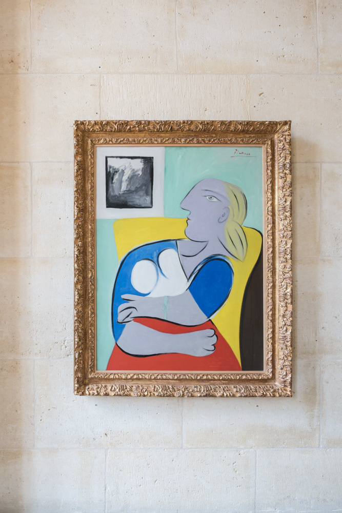
See how the top of her body is twisting towards the image in the upper left?
The more abstract painting above is not as figurative as the ones I remembered. I guess the Tate Modern didn't allow photography, because I have no snaps of these.
Now there's two more things at issue here. Let's assume for the moment that you accept my Picasso's interest in double triangles to represent non-planer masses. It works great here, but in some of the reclining figures not so well. To demonstrate what I was talking about to my partner I just cut out a double triangles in paper and twisted them. Dead simple. Did Picasso do this? I don't think he did. Why? Because when I spotted the double-triangles in some of the paintings it didn't work, they didn't impart planes, just triangles. Was he doing something else? Probably, but I think it's pretty clear he was first after what I'm going on about. Had he cut out paper and fiddled with it, he would have quickly seen what sorts of angles worked, and what didn't.
What this suggests to me is that Picasso did a lot of his visual tinkering from the figure, meaning with his model right in front of him. And likely he might have made this a kind of rule.
The second thing about Picasso is that none of this triangle stuff seems consistent enough to suggest it was even close to being a primary interest; what might he really be after? (He was also very clearly determined to use the general principles of cubism to show butt and breasts, and pudendum in the same painting.)
I walked into a gallery at ACE in Beverly Hills where there were at least two dozen 3/4 size bronze busts of women by Robert Graham. In this crowd from the door, I immediately spotted the sculptural portrait of Angelica Huston even though she was deep into this 'crowd' and was facing away from me. That's accuracy in representational art. Graham was married to Angelica, I worked for him and saw her many times. I've recognized in person more than a couple of his models up to five years after they were sculpted by Bob.
It's very clear to me that art made from a live subject in the studio, is very different from art made from photographs, or from following proportion formulas.... There is nothing more boring than a whole slew of sexy women art that have no real model. Are you bored? It's not from life.
Picasso understood this, but he also had to understand this and a whole lot more because he had 80 years of work. Experience counts for a lot. So I can say, I notice this about Picasso's work, his practice. I know a lot, because I'm 60 years younger than Picasso, I should have been able to begin with more information than Picasso, and yet my experience informs me that someone having done a lot more over a longer period of time will not only know and understand some things much better, but probably also knows things he's not even aware of.
So Bill Brice. He started out working with models, was accomplished in all the art school requirements and skills. I think Brice probably worked a lot without a physical model and this is why his visual tricks pop in and out. It's probably not better, it probably limited his art, but he worked at it and made art.
And while I'm dropping names. The Tate Modern. Seemed a bit hoidy-toidy. Something about the place was annoying to me. But Picasso? Okay.
Going up the escalator to the show, you can see a video clip of Picasso from 1932, home movies kind of stuff. The first glimpse of Pablo is between the legs of the people ahead of you on the escalator. He's sort of mugging at you, like Lita Albuquerque and Jim Morphesis peeking into your car window on the L.A. freeway in Kent Twitchell's pair of murals made for the 1984 Olympics Arts Festival. So ten points Gryffindor for this.
The show was pretty good. I never get those zombifying headsets with the curator droning on about stuff that has nothing to do with what the art is doing or trying to do. I'm not even sure which wife and which mistress were at issue in 1932. #MeTooPicasso? I'd be shamed for writing about the old philanderer and user.
So the way I look at art is probably like Jay Leno looking over a dusty car in a garage: is it the rare model or the common one? Are the tires original? Does it have the dual exhausts? Is this the one with the vacuum cruise control.... poking here and there. Seeing something in two paintings deep into the show, the triangles, and then going back to the beginning and looking for them in paintings I'd already looked at.
I noticed this old man in a wheel chair with two very doting young companions. He had a huge head. The companions were calling him, "Sir John." Must be somebody somebody I thought. In front of one painting of a nude with black strips he said, "Almost no one notices that she's tied up." I certainly hadn't noticed. He said a couple of other things that made me think, "This guy knew Picasso. Cool."
Later I gave Google a shot. Easy. Sir John Patrick Richardson, art historian, 94 years old, biographer and friend of Picasso, Francis Bacon and Lucien Freud (two other artists who work was was looking for. Bacon is right handed, Freud left handed. I guessed this from looking at their work. This will be part of my How To Look At A Rembrandt -- if by any chance you immediately know exactly what I'm talking about, let me know. ) So that's cool. I didn't bother him. I didn't know anything about him or his work, so I had nothing to say. What I've found is that a book is very almost always more interesting than meeting the person who wrote it. A meeting is so shallow, the famous person is going to do what? Immediately tell you what they're working on now? (If they do that they're a dull self-promotor and they've walked up to you.)
If you do the 6 Degrees of Separation to this blog it'll be pretty impressive. We are all much more connected than we realize. If we pay attention, think about things; learn as much as we can about how the world, and the things in, it work and keep a journal, have a good memory-- it's amazing how connected we all are to everything else.
Okay, enough nonsense.


